


This kind of logo will be the best way to go, every time
When you have been in the design industry as long as we have, you get to see it all: the good, the bad and the downright ugly. When it comes to logos, you could argue it all comes down to personal preference.
But look at big business and one approach clearly dominates the marketplace: the minimalist logo.
Far from being a new trend, minimalism is about keeping things simple and focusing only on what is necessary. Forget intricate embellishments. The minimalist logo lives by “less is more”, and that restraint is exactly what gives it such impact. Here is why the world’s biggest brands reach for simple, minimalist logos, and why you probably should too.
Contents
- What is a minimalist logo?
- A minimalist logo’s association game is strong
- They are adaptable and versatile
- People instantly recognise them
- Simple, but not the same
- Frequently asked questions
What is a minimalist logo?
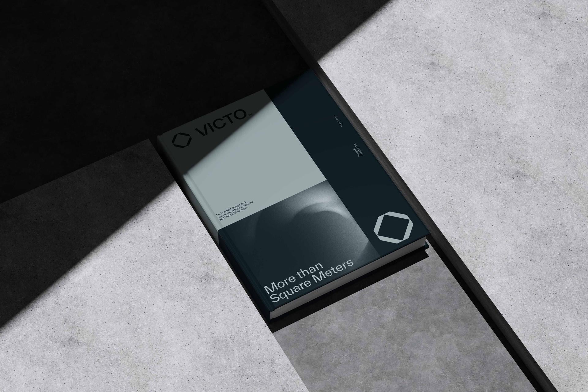
A minimalist logo strips a brand mark back to its essentials: clean lines, simple shapes, often a single colour, and nothing that does not earn its place. You only need to look at some of the world’s biggest companies to see it in action. The five rings of the Olympics, Apple’s bitten apple, the Nike tick. The essence of every one of them is simplicity.
One common mistake is to think of a logo as a form of art. It could not be further from that. Yes, it is a visual representation, but it plays a functional role within a business: it is the wordmark, icon or image that lets customers identify you in an instant. That is exactly why design is about results, not decoration, and it helps to understand the different types of logos before deciding which minimalist route suits your brand.
| Iconic minimalist logo | Why it works |
|---|---|
| The Olympic rings | Five simple shapes, recognised the world over |
| Apple | A single clean symbol, no words needed |
| The Nike tick | One stroke, total recognition |
| Netflix | A bold letter in one unmistakable colour |
A minimalist logo’s association game is strong
Think of the red N of Netflix or the blue f of Facebook. It takes us no time at all to familiarise ourselves with these simple yet effective minimalist logos. They embed themselves deep in our brains and become recognisable at a single glance, which is precisely the job a logo exists to do.
Colour plays a role in that association too. While it is not always the case, minimalist logos often opt for minimal colours, and for good reason. Colour is a significant part of logo design, and a brand is far more likely to become strongly associated with a colour when it commits to just one. For more on this, see our piece on how colour influences your customers.
They are adaptable and versatile
Your logo is printed and displayed in countless places: your website, business cards, letterhead and email banners, possibly even uniforms, merchandise and billboards. In 2026, add to that app icons, favicons, social avatars and profile pictures, often just a few pixels across. The more surfaces your logo has to live on, the more its simplicity earns its keep.
By sticking to simple shapes and colours and avoiding superfluous gradients, a minimalist logo can be reproduced across all of these materials without compromising its recognisability. A busy, detailed logo might look fine on a big screen and fall apart the moment it has to shrink to a favicon. A minimalist one holds its own everywhere.
People instantly recognise them
When there is too much going on, a logo becomes convoluted and jarring to the eye, a bit like the visual equivalent of a traffic jam. Simple, minimal design commands attention in a way that flowery, excessive imagery never will. We cannot help but be hooked in by a bold yet simple wordmark or symbol.
| Quality | Minimalist logo | Cluttered logo |
|---|---|---|
| Recognition | Instant, at a glance | Slow, the eye has to work for it |
| Scaling | Holds up tiny | Falls apart at small sizes |
| Memorability | Sticks in the mind | Easily forgotten |
| Versatility | Works on any surface | Breaks across surfaces |
That instant recognition is one of the clearest markers of a good logo versus a bad one.
Simple, but not the same
There is a catch worth knowing, though. Because minimalism works so well, almost everyone has rushed towards it, and a lot of brands have ended up looking the same: the same clean sans-serif wordmark, the same flat single colour, the same safe simplicity. Designers even have a nickname for it, “blanding”. When a whole category minimises in the same way, nobody stands out, which defeats the entire purpose of a logo.
So the goal is not just simple. It is simple and distinctive. The best minimalist logos are pared back to one clear, ownable idea, not pared back until there is nothing left to recognise. Getting that balance right is harder than it looks, and it is where a considered approach to your logo design, grounded in a clear brand strategy, makes all the difference. Simple is the easy part. Simple and unmistakably you is the skill.
Frequently asked questions
What is a minimalist logo?
A minimalist logo is a brand mark stripped back to its essentials: clean lines, simple shapes, often a single colour, and nothing that does not earn its place. Think of the Nike tick or the Apple symbol. It follows the principle that less is more, using restraint to create a stronger, more memorable impact.
Why do big brands use minimalist logos?
Because simplicity does the job a logo exists to do. Minimalist logos are easy to recognise at a glance, build strong associations quickly, and work across every surface from a billboard to a favicon. The world’s biggest brands, from Apple to Nike to Netflix, rely on simple marks for exactly these reasons.
Are minimalist logos better?
For most businesses, yes, because they are more recognisable, more versatile and more memorable than busy, detailed logos. The one caveat is that minimalism done lazily leads to brands looking identical. The best approach is simple and distinctive, pared back to one clear, ownable idea rather than simply pared back.
What makes a good minimalist logo?
A good minimalist logo is simple, scalable and instantly recognisable, but it is also distinctive. It holds up in black and white and at tiny sizes, uses colour deliberately, and captures one clear idea that is unmistakably yours. Simplicity alone is not enough if it leaves you looking like everyone else.
Can a minimalist logo be too simple?
Yes. When a logo is stripped back so far that it looks like every other brand in its category, it stops doing its job. This is the trap of “blanding”, where so many brands minimise the same way that none of them stand out. The fix is to keep it simple while making sure it is still distinctive and ownable.
How many colours should a logo have?
There is no hard rule, but minimalist logos often use just one or two colours. Committing to a single colour makes it far easier for a brand to become strongly associated with that colour over time. It also keeps the logo clean, versatile and easy to reproduce across different materials.
Read more: What’s the deal with logo prices varying so wildly?
Ready to build a brand that drives growth?
Wherever your vision leads, we turn it into something people can see, feel and rally behind.