


Use these website design hacks to increase conversion

Website design is pretty key to sales. These days, you’ve got less than 15 seconds to hook someone in.
That’s the average amount of time a user will spend on a website. If they don’t like what they see in that time, they’re going elsewhere and you’ve lost yourself a customer.
Use these website design hacks to keep your users happy and increase your conversion rates. And remember, conversion doesn’t necessarily mean an outright sale. It can also include signing up for newsletters, free content or sharing on social media since these all have the potential to convert to sales down the track.
Contents
- 1. Tidy up your graphic design
- 2. Tidy up your technical design
- 3. Tidy up your navigation
- 4. Tweak your performance
- The anatomy of a high-converting page
- FAQs
1. Tidy up your graphic design
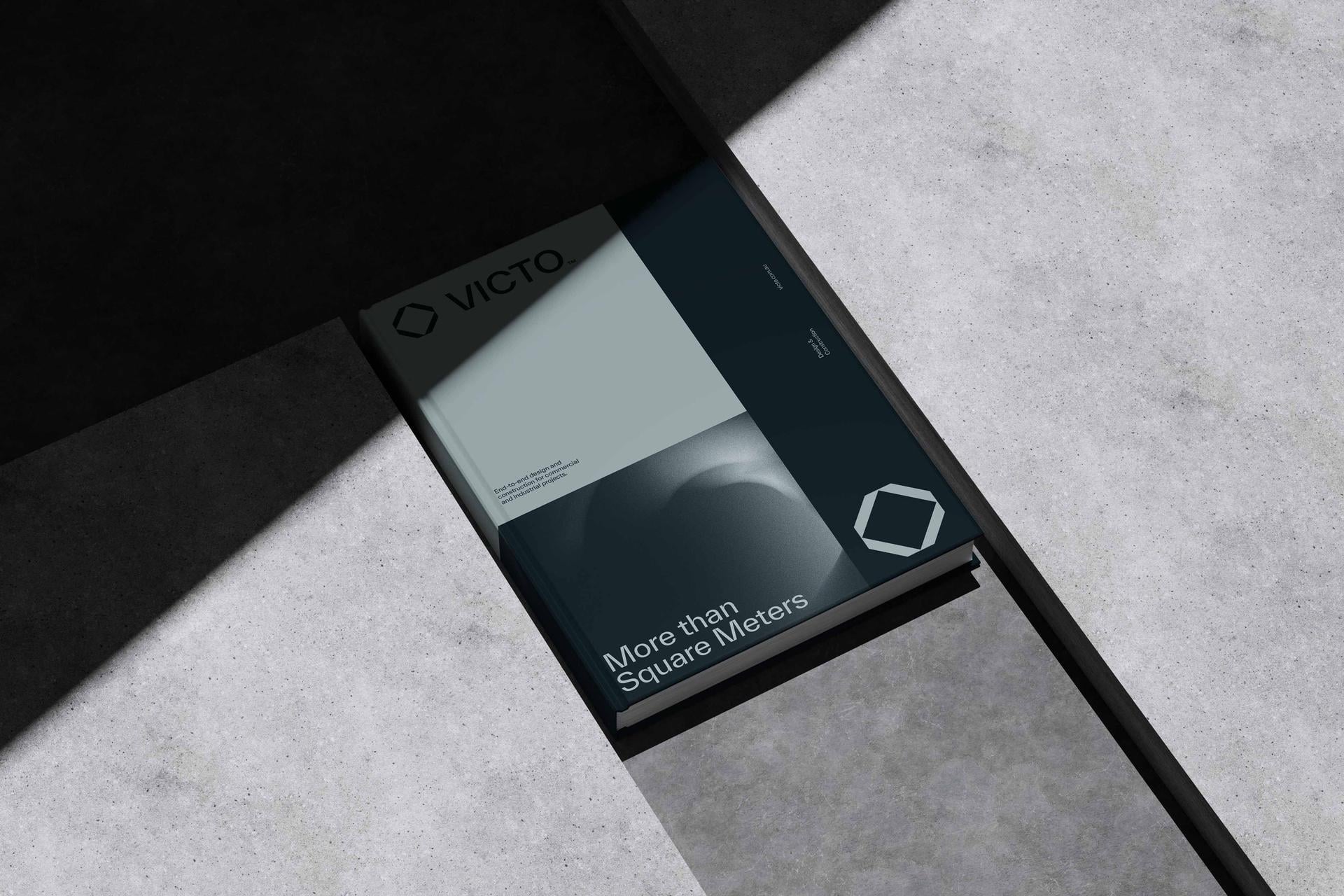
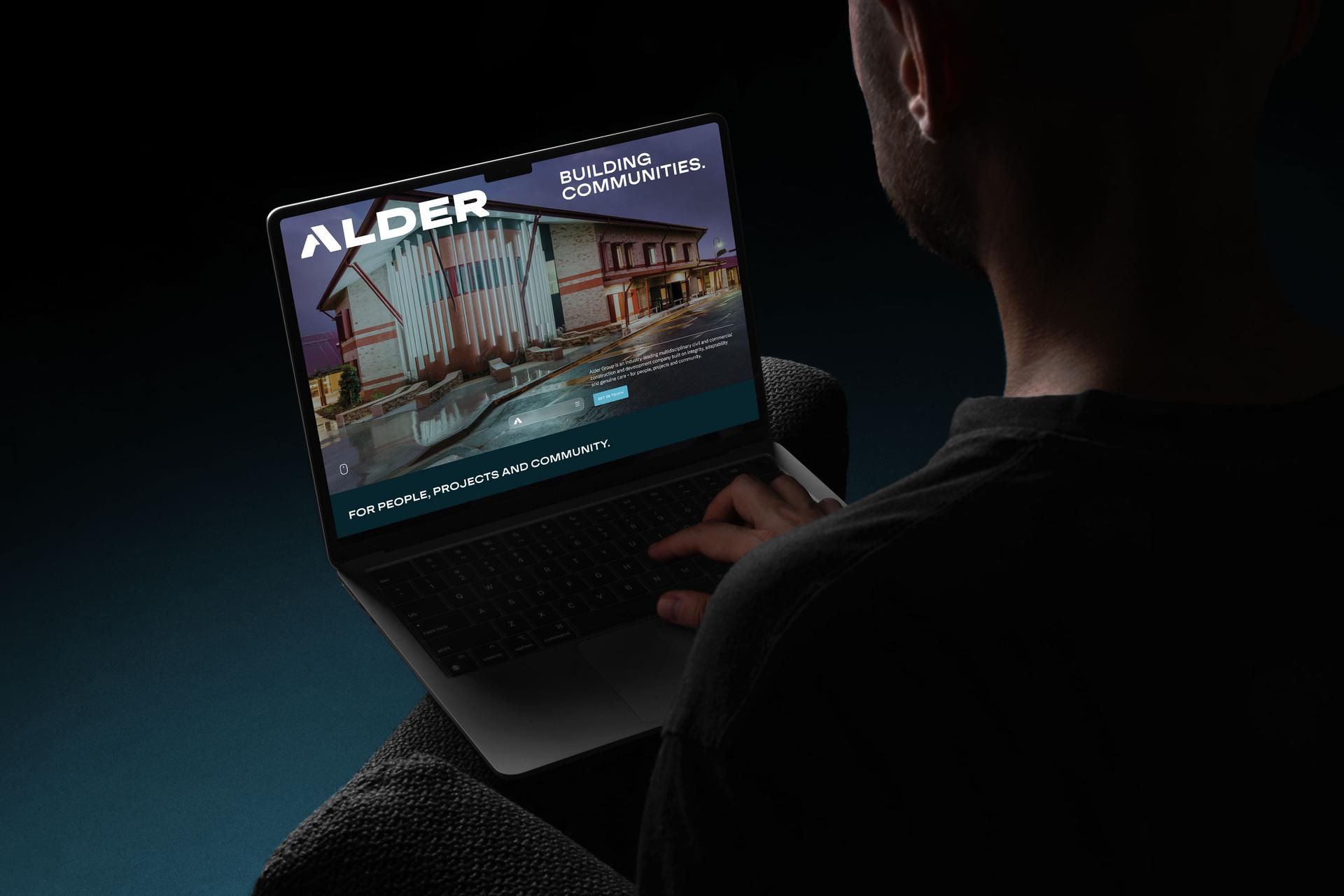
Uninspiring template? Self-built website? It might seem basic but the way your website looks (and loads) is a critical aspect of its design. This will shape a user’s first impression of your business. A basic website, maybe one you’ve designed yourself, can give the impression you’re not a legitimate business. Professional website design has never been more important.
Fair or not, people judge your business by your website in a heartbeat. A polished, professional design signals that you’re credible and that you take what you do seriously, while a clunky, dated one quietly plants doubt before a visitor has read a single word. The best design doesn’t shout for attention either, it just works, guiding the eye and making everything feel effortless. That’s the mark of good design: you don’t notice it, you just trust it.
2. Tidy up your technical design
Slow loading images? Non-responsive design? These things can be irritating to a user. If your website takes a long time to load, you’re cutting into your valuable 15 seconds. And if a user has to expand a site on their mobile just so they can click a button, they’re probably not going to bother. There are other technical aspects that can make a huge difference to your conversion rate. Build engaging content around strong keywords to boost SEO and don’t forget about schema, on-page tags and XML sitemaps.
The technical side is the part nobody sees but everybody feels. A site that loads in a second or two, behaves perfectly on a phone and is easy for search engines to read will quietly outperform a prettier site that’s slow and clunky. Speed especially is a silent conversion killer: every extra second of load time gives a visitor another reason to leave. Get the foundations right and everything else you do works harder.
3. Tidy up your navigation
How easy is your website to get around? If a user has to click themselves into a black hole just to find what they’re looking for, you need to do something about that. Think simple, effortless navigation. Your website should be designed with the user experience in mind.
Good navigation is invisible: people find what they want without ever thinking about it. The trick is to structure your site around what your visitors are looking for, not around your internal org chart. Keep menus short and obvious, use plain language rather than clever labels, and make sure any given page is only a click or two away. This is where solid information architecture earns its keep, and it feeds directly into the page structure we’ll get to below.
4. Tweak your performance
In the same way that you need to keep putting logs onto a fire to keep it burning, you need to keep reviewing your website design and tweak it for optimal performance. Use tools such as Google Analytics, Google Search Console and Moz (for metrics like Domain Authority) to see your current performance and what needs to be adjusted to improve it.
A website is never really “finished”. The best-performing sites are treated as living things, watched, tested and refined over time. Look at where people land, where they drop off, which pages convert and which don’t, then make small, deliberate changes and measure the result. Even minor tweaks to a headline, a button or a page layout can add up to a meaningful lift in conversions over time.
The anatomy of a high-converting page
One of the biggest levers you can pull is the order things appear in as a visitor scrolls down the page. A converting homepage or service page isn’t a random pile of sections, it follows a deliberate sequence that mirrors how someone makes a decision: do I trust you, do you get my problem, can you solve it, can I believe you, what do I do next? Here’s the best-practice structure, top to bottom, for a homepage or service page.
| Section (top to bottom) | What it does | Importance | Why it works |
|---|---|---|---|
| Hero and USP (above the fold) | A clear headline saying what you do and who for, your USP, and a primary call to action. | Critical | It’s the first thing seen and where the 15-second decision is made. It has to answer “am I in the right place?” instantly. |
| Primary CTA | One clear action: book, enquire, buy or sign up. | High | Tells visitors exactly what to do next while their interest is highest, with no friction. |
| The problem | Name the pain point or challenge your audience is facing. | High | Shows you understand them, which builds instant relevance and connection. |
| The solution and benefits | How you solve that problem, framed as benefits rather than features. | High | Connects your offer directly to the outcome the visitor actually wants. |
| Social proof | Testimonials, reviews, client logos, ratings or results. | High | Overcomes doubt. People look to others when deciding whether to trust you. It’s a big part of why people choose you. |
| How it works | A simple step-by-step of what working with you looks like. | Medium | Reduces uncertainty and the fear of the unknown, which lowers perceived risk. |
| Why us / differentiators | Your why, your story and what really sets you apart. | Medium | Builds trust and an emotional connection, and separates you from look-alike competitors. |
| Objections and FAQ | Answer the common hesitations and doubts head-on. | Medium | Clears the last few barriers standing between interest and action. |
| Final CTA | Repeat your main call to action at the bottom of the page. | High | Catches the people who needed to read everything first. Never make a ready buyer scroll back up. |
| Footer | Navigation, contact details, and trust signals like credentials. | Low to medium | Supports both the ready-to-act and the researchers, and reassures on credibility. |
You won’t always need every section, and the wording will change for every business, but the underlying logic holds: lead with clarity, build trust, handle objections, and always make the next step obvious.
Small, deliberate improvements to how your website looks, loads and flows compound into real conversion gains over time. If you’d like an outside read on how your website and brand are working together, a free brand audit is a good place to start, or dig into our complete guide to website design and our website work.
Leave your mark.
FAQs
How long do I have to capture a website visitor?
Not long at all. The average visitor spends less than 15 seconds on a website before deciding whether to stay or go. That tiny window is why your hero section, the part that loads first, matters so much: it has to instantly tell people what you do, who it’s for and why they should care. Lose them in those first few seconds and most won’t scroll far enough to give you a second chance.
What does “conversion” mean on a website?
A conversion is any action you want a visitor to take, and it doesn’t have to be an outright sale. Signing up for your newsletter, downloading free content, making an enquiry or even sharing your page on social media all count, because each one moves someone closer to becoming a customer down the track. Thinking about conversion this broadly helps you design pages that capture interest at every stage, not just at the point of purchase.
What makes a website convert better?
A mix of four things: professional design that earns instant trust, solid technical performance (fast loading, mobile-friendly, search-friendly), effortless navigation, and a deliberate page structure that guides visitors from interest to action. On top of that, you keep reviewing and tweaking based on real data. Get those working together and you’ll convert far more of the traffic you’re already attracting.
What order should the sections of a homepage be in?
A high-converting page generally follows the order a person makes a decision in: a clear hero and USP with a call to action, then the problem you solve, your solution and benefits, social proof, how it works, what sets you apart, objection-handling or FAQs, and a final call to action, with a useful footer to finish. You won’t always need every section, but leading with clarity and building trust before asking for the sale almost always works best.
Why does website loading speed matter so much?
Because speed is a silent conversion killer. If your site takes too long to load, you’re burning through your precious 15-second window before a visitor has even seen your offer, and many will give up and leave before the page appears. Faster sites keep more people, convert better and tend to rank better in search too, so improving load time is one of the highest-value technical fixes you can make.
How often should I update my website?
Treat your website as a living thing rather than a set-and-forget project. You don’t need a full rebuild often, but you should regularly review your analytics, see where people are dropping off, and make small, deliberate improvements. Reviewing performance every quarter is a sensible rhythm for most businesses, with bigger reviews once a year or whenever your offer, audience or brand shifts.
Ready to build a brand that drives growth?
Wherever your vision leads, we turn it into something people can see, feel and rally behind.