


Alder Group
Building Communities
Unifying two decades of Gold Coast construction under one master brand.
Alder Group came to Embark after more than twenty years building across the Gold Coast. The business was in strong shape. The brand was not. Alder Developments and Alder Constructions carried separate signals, splitting recognition and making the group harder to read than it needed to be. The identity had aged around the work rather than with it. Our role was to unify the architecture, rebuild the identity and reposition Alder Group as the market leader its record already supported.


The business had outgrown the brand that built it.
Alder was never short on capability. Twenty years of delivery, long client relationships and a team that knew the Gold Coast better than most. The problem sat between that record and how the business presented. Prospects formed a judgement from a brand that suggested a smaller, older operator, then discovered the reality later. That gap costs money. It shows up in tender shortlists, in pricing confidence and in who wants to work there.
Underneath it sat a structural problem. Alder Developments and Alder Constructions served distinct audiences with no architecture holding them together. The market saw two smaller businesses rather than one group with two capabilities. Reputation earned on one side never transferred to the other. Competing against national builders with deeper budgets, that fragmentation was the most expensive thing about the brand. Alder needed to look like one organisation with twenty years behind it.


One master brand, built to carry the whole group.
The first decision was architectural. We moved Alder to a branded house, with Alder Group as the master brand and the development and construction arms endorsed beneath it. Every project, tender and site sign now compounds the same name. The sub-brands keep enough distinction to speak to their own audiences without spending equity twice. For a business competing above its weight, consolidating recognition was the highest leverage decision available.
We rebuilt the story on what made Alder different. Not scale or price. A family owned business that had spent two decades building in the communities it lives in. That produced the tagline, Building Communities, reframing Alder from a contractor delivering projects to a business invested in what those projects become. Authentic, community and family owned became the values holding the messaging together, and gave the team language they could use in tenders.

An identity with the weight of the work behind it.
The identity had to carry the substance of the business without overstating it. The logotype sits in capitals with squared vertical terminals, giving the letterforms an engineered quality rather than a decorative one. Small detail, real work. It signals precision and permanence to an audience that judges on exactly that. The mark holds at business card scale and across a site hoarding, which mattered more than any aesthetic preference.
Colour followed the same logic. A single dark teal blue replaced a dated, inconsistent scheme, chosen for restraint and for how it holds up in print, on vehicles and in high visibility environments. Fine line work references the technical drawings that precede every build, adding precision without clutter. Restricting the palette was also practical. A construction group applies its brand through people who are not designers, so the system had to stay consistent without supervision.


CommunityExperiencedFamily ownedGenuinePassionateProfessional


A brand that had to survive a construction site.
Strategy only counts once it reaches the market. The rollout covered capability statements, brochures, stationery, signage and hoardings, vehicle livery and site apparel. Construction brands live outdoors and under wear, so each application was tested against how it would look after six months on site rather than in a mockup. Every touchpoint now reinforces the master brand, which turns twenty years of separate impressions into one accumulating reputation.
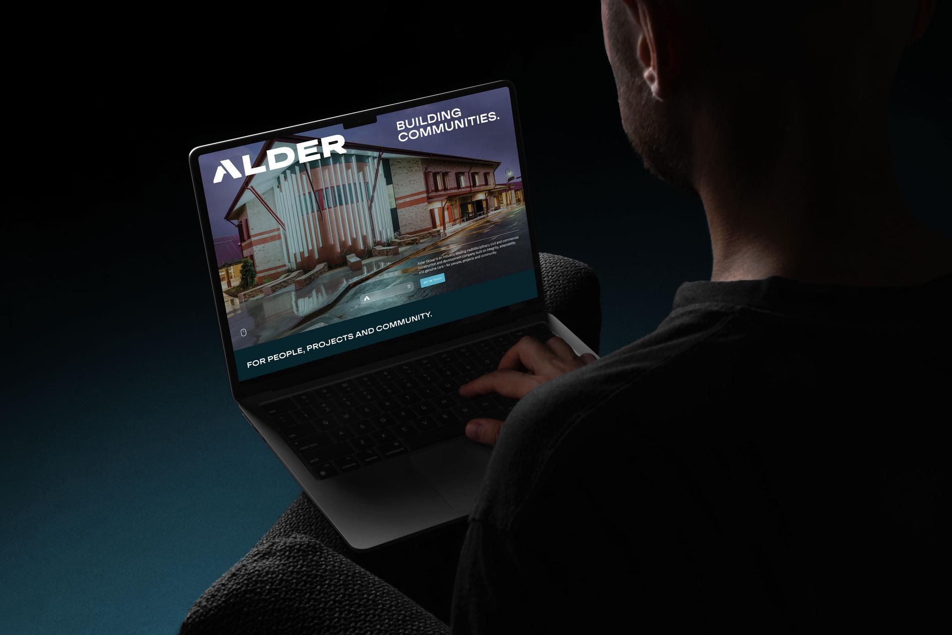
Website structure and content follow how clients actually assess a builder, capability, track record and the people behind the work, with the group and its two arms clearly explained. Copy was rewritten to the new messaging so the site sounds like the brand rather than a separate voice. The result supports tenders and referrals instead of undermining them, and the team can run the system themselves as the group takes on larger projects.

The outcome: a construction group positioned to lead.
Alder Group now presents as one business rather than two. The architecture is clear, the identity matches the calibre of the work, and the brand no longer needs explaining in the room. Twenty years of delivery compounds under a single name, strengthening tender positions, supporting more confident pricing and making the group a more credible employer in a tight labour market. The brand still reads as family owned and community minded, because that is the truth of the business, not a marketing position.
Established. Unified. Precise. Built to carry the next twenty years.


Alder has worked with James and Phil throughout our 20+ years in operation, so when it came time to seek branding advice, Embark was the obvious choice. The direction to rebrand wasn't what we initially had in mind, but James guided and challenged us through the process, helping us uncover who we truly are and where we want to be. The rebrand honours Alder's roots while giving us a bold, authentic identity for the years ahead. It's something we're incredibly proud of. James, Phil, and the Embark team are our trusted brand partners.

