


Optimising your website for the shortening attention span

You have heard it said that our attention spans are shrinking. The reality is a little more nuanced, and more useful to understand.
It is not that people have lost the ability to concentrate, it is that online, with endless choice a click away, we have grown impatient. Research by Dr Gloria Mark at UC Irvine found that the average time we focus on a single screen has fallen from about two and a half minutes in 2004 to roughly 47 seconds today.
For your website, the takeaway is simple but stark: you have only seconds to capture a visitor before they decide whether to stay or click away. The Nielsen Norman Group puts that window at around 10 to 20 seconds. So how do you make those seconds count? Here are our top tips for optimising your website to hook visitors fast and turn them into conversions.
Contents
- Make your website load quickly
- Capture interest above the fold
- Prioritise your visual design
- Be clear about what you do
- Keep your messaging clear and concise
- Don’t neglect mobile
- Frequently asked questions
| Tip | Why it works |
|---|---|
| Load quickly | People won’t wait more than a few seconds |
| Optimise above the fold | Grab interest before they scroll |
| Prioritise visual design | Relevant visuals hold attention |
| Be clear about what you do | Visitors decide in seconds |
| Keep messaging concise | Impatient visitors want fast answers |
| Don’t neglect mobile | Most visitors are on phones |
Make your website load quickly
A fast-loading website is the first and probably most important factor, because no one waits around any more. We are used to information arriving instantly, and your website should be no exception. The longer a page takes to load, the more visitors you lose before they have even seen it. More than half will abandon a page that takes longer than about three seconds, so if your site is slow, you could be losing a huge slice of your traffic before you have had the chance to impress anyone.
It is well worth learning exactly how fast your website should load and what to do about it, since this single factor underpins everything else on this list.
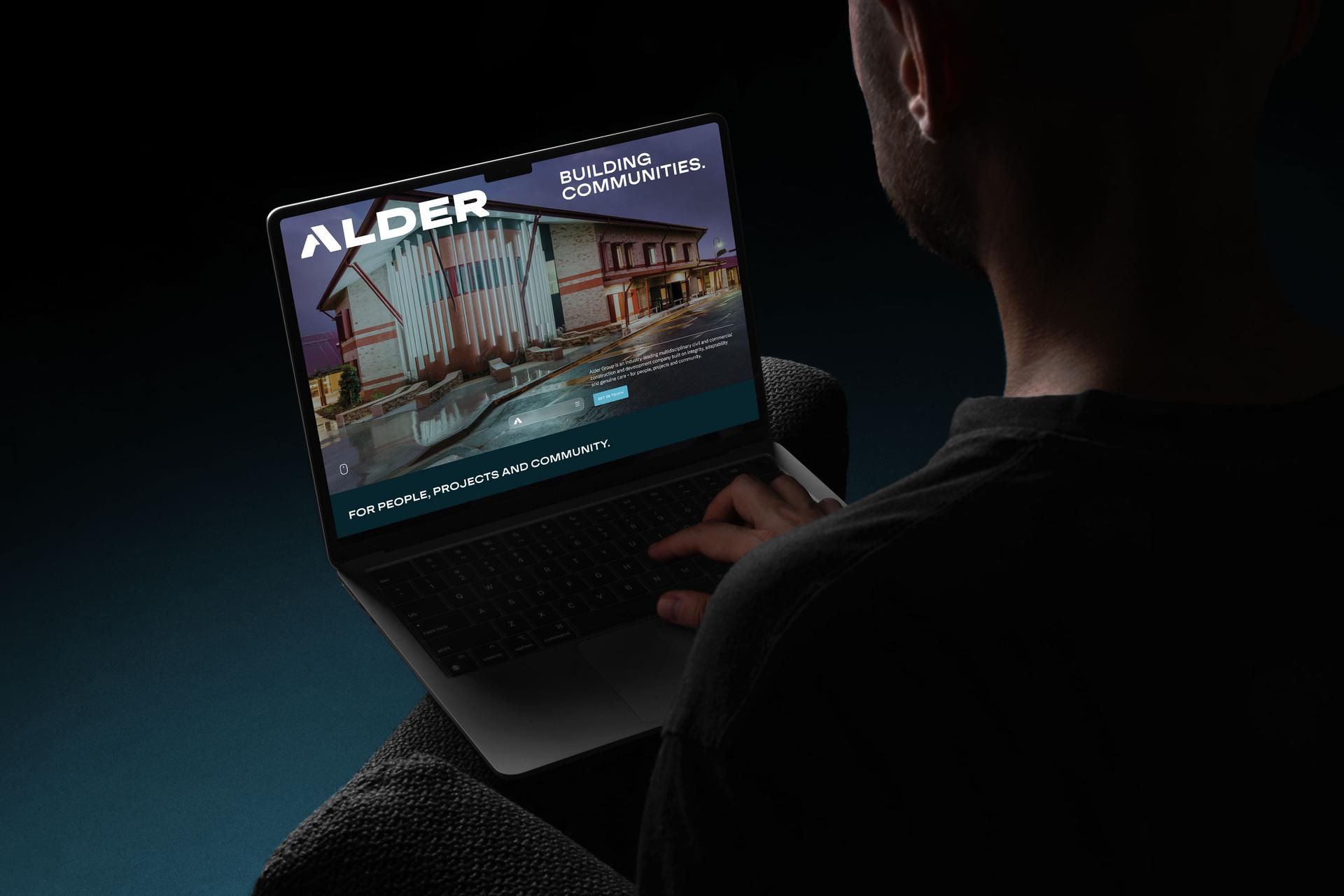
Capture interest above the fold
With attention so short, you need to grab interest immediately, and the best place to do that is “above the fold”, the part of your website that is visible without scrolling. On most homepages this is a banner and some form of call to action for new visitors, and it is the prime real estate you should optimise hardest.
A strong above-the-fold call to action earns its keep in several ways: it engages visitors and sparks interest in your products or services, it guides them towards the next step in your sales funnel, and it tells them exactly what to do if they like what they see. Without one, you leave visitors with no direction, and undirected visitors tend to navigate away. Getting this right is core to good web design that converts, and to a considered UX design process.
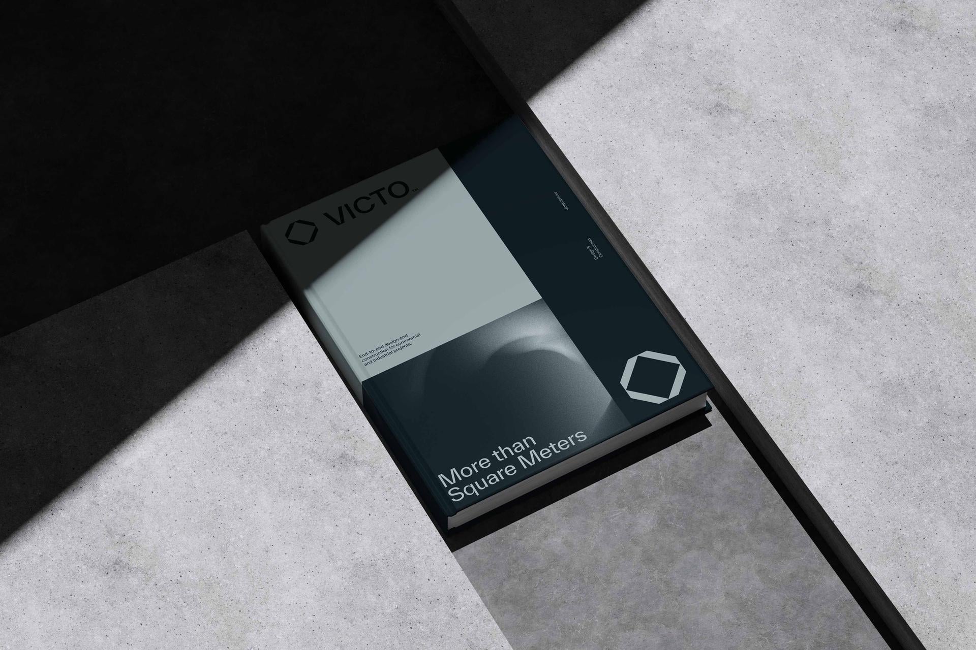
Prioritise your visual design
Your website’s visual appearance should be interesting and appealing to your target audience. The right imagery, colour schemes and graphics all help hold a visitor’s interest and feed those short attention spans.
That said, be disciplined about it. Avoid adding visuals just for the sake of it, since decoration for its own sake tends to distract from the actual purpose of the page. Afterthought design flourishes usually do more harm than good. Keep your visuals relevant to your audience, and be careful not to overdo it.
Be clear about what you do
A new visitor should be able to work out what you do, and what you are offering, within the first few seconds of arriving. If you are not communicating that clearly, you make it harder for them to answer the only question that matters to them: “is this business right for me?”
You can get this across quickly through your logo, tagline and the call-to-action messaging in your above-the-fold section, then back it up with a short summary of your products or services on the homepage, without going into too much detail. A big part of standing out here is being clear on what makes you different.
Keep your messaging clear and concise
Shorter attention spans come with shorter patience. Assume your visitors are impatient and want their questions answered as fast as possible, which is where clear, concise messaging earns its place. Good website messaging answers four key questions:
| Your homepage should answer | Where it lives |
|---|---|
| What is this site about? | Logo, tagline and above-the-fold content |
| What do you offer? | Three to five product or service summaries |
| What makes you different? | A short paragraph (link to About for more) |
| What should I do next? | Clear calls to action throughout |
On your homepage, each of these can become its own section. “What is this site about?” is answered by your logo, tagline and above-the-fold content. “What do you offer?” is a simple summary of three to five products or services, kept brief. “What makes you different?” is a short paragraph, with a link through to your About page if you have more to say, rather than overloading the homepage. And “what should I do next?” is answered by clear calls to action spread throughout the page, so be explicit, whether that is “contact us” or “buy now”. Writing all of this well is the heart of strong website content.
Don’t neglect mobile
Finally, do not neglect mobile. Most web traffic now comes from phones, well over half of it, so for many visitors the mobile version is the only version they ever see. If your site is awkward on a phone, you are delivering a poor experience to the majority of your audience and missing out on conversions. Google indexes mobile-first too, so a weak mobile site quietly drags down your rankings as well.
Review your own website on a mobile device and fix anything clunky, it should be as fluid and easy to navigate on a phone as it is on a desktop. If you run into problems, so will your visitors. Making your site fully responsive is the fix, and a well-built website handles it from the ground up.
Frequently asked questions
How long do I have to capture a website visitor?
Only seconds. The Nielsen Norman Group suggests you have around 10 to 20 seconds to engage a visitor before they leave, and many decide far faster than that. This is why a fast-loading page, a strong above-the-fold message, and instant clarity about what you do are so important to keeping visitors on your site.
Are attention spans really getting shorter?
It is more nuanced than the popular claim. People have not lost the ability to concentrate, but online, with endless choice a click away, we have grown impatient. Research by Dr Gloria Mark found the average time we focus on a single screen fell from about 2.5 minutes in 2004 to roughly 47 seconds. For websites, that means you must earn attention quickly.
What does ‘above the fold’ mean?
Above the fold refers to the part of your website that is visible without scrolling, the first thing a visitor sees. On most homepages it features a banner and a call to action. Because it is the first impression, it is the most valuable space on the page and the part you should optimise hardest to capture interest.
How do I grab a visitor’s attention quickly?
Make your site load fast, lead with a strong above-the-fold message and call to action, and be instantly clear about what you do and why you are different. Keep your visuals relevant and your messaging concise, and make the next step obvious. The goal is to answer “is this right for me?” within the first few seconds.
Why does website speed matter for attention?
Because impatient visitors will not wait. More than half abandon a page that takes longer than about three seconds to load, often before they see any of your content. A slow site loses you visitors and conversions before you have had a chance to make an impression, which is why speed is the foundation of capturing attention.
How important is mobile for capturing attention?
Very. Most web traffic now comes from mobile devices, so for many visitors the mobile experience is the only one they have. A clunky mobile site frustrates the majority of your audience and costs you conversions, and since Google indexes mobile-first, it hurts your rankings too. A responsive, mobile-friendly site is essential.
Read more: 5 ways to give your website a better user experience
Ready to build a brand that drives growth?
Wherever your vision leads, we turn it into something people can see, feel and rally behind.