


The invisible power of good design

We’ve all felt it. The subtle frustration when a zipper jams, a scoop won’t fit into a supplement jar, or a website buries its contact button under five dropdowns.
These little moments of friction might seem small, but over time, they shape how we feel about the product, the brand, and the people behind it.
That’s the power of good design. But here’s the thing, good design doesn’t scream for attention. It disappears. It lets the user move fluidly through the experience without thinking. It’s only when design fails that it becomes visible. In this article, we explore why “good design is invisible” should be the goal, and how applying this principle to your website, brand, and customer experience can dramatically improve engagement, trust, and conversion.
Contents
- Good design is invisible; bad design causes frustration
- Good design is everywhere, not just websites
- In an information-rich, time-poor world, simplicity wins
- Simplicity isn’t basic, it’s genius
- How to design an invisible experience that converts
- Conclusion
- Invisible design FAQs
Good design is invisible; bad design causes frustration
Invisible design is intuitive. It’s when a customer lands on your website and immediately knows what you do, where to click, and how to get in touch. There’s no second-guessing or pausing. But when design is clunky or unclear, users get stuck, and stuck users don’t convert. They leave.
Bad design draws attention to itself in all the wrong ways. Think of a form that’s hard to submit, a button that doesn’t work on mobile, or messaging that uses vague buzzwords instead of clear offers. These friction points cause micro-annoyances that add up fast, and they quietly kill trust.
When users can’t complete the task they came to do, they’ll blame the experience, not themselves. Your brand takes the hit.
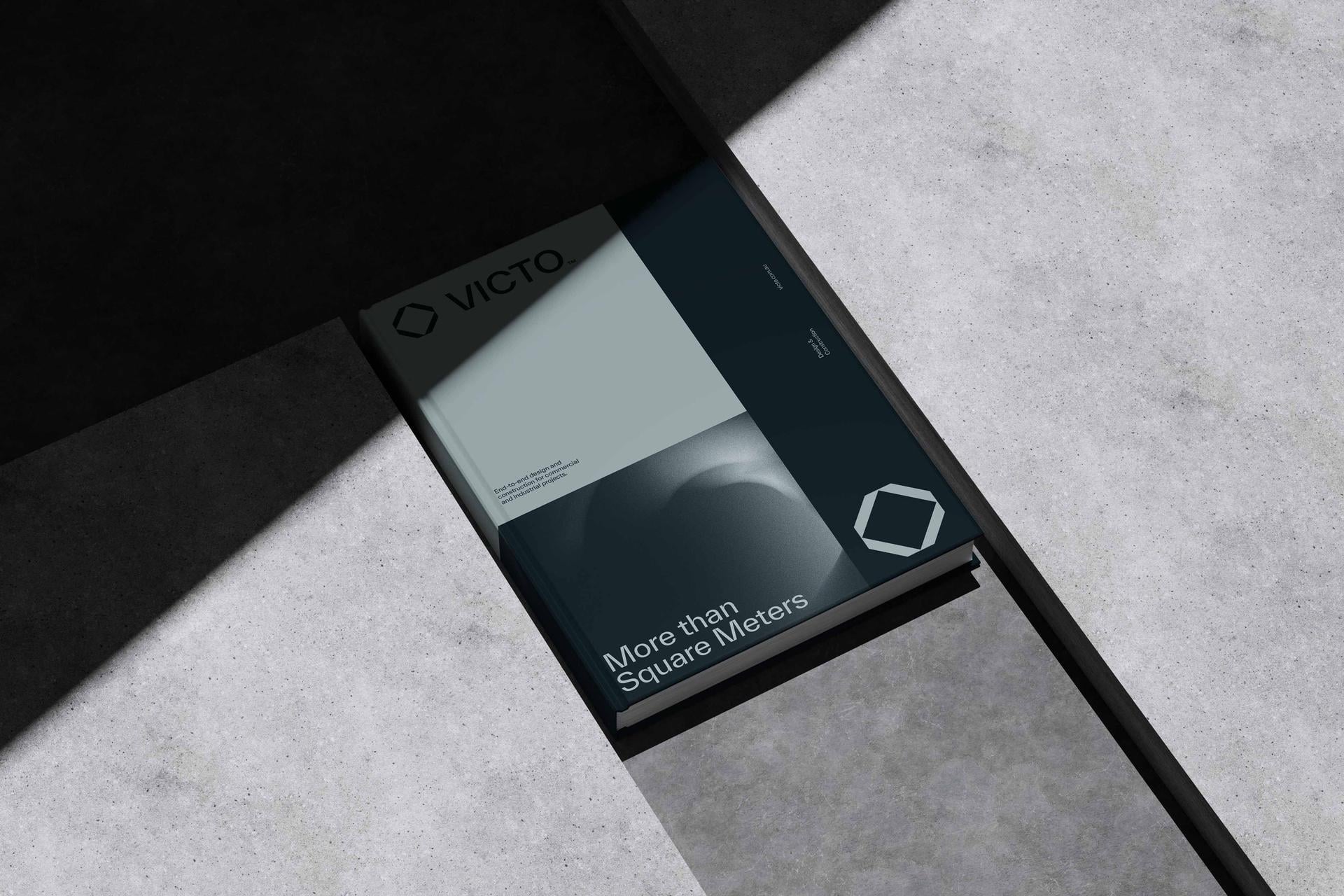
Good design is everywhere and it’s not just about websites
We often think of UX in digital terms, but the reality is: everything we interact with is designed. Think about a coffee cup lid that leaks or a supplement jar with a scoop too big to use. These are failures of design. They create user frustration, and that frustration erodes brand perception.
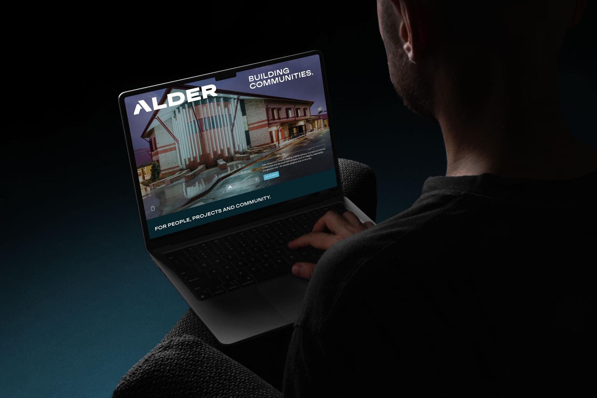
Your website is no different. If it doesn’t guide users easily from interest to enquiry, it’s working against you. Great brands treat every touchpoint, from packaging to proposals, with the same user-first mindset. Because the moment your design gets in the way of someone doing what they need to do, they’ve already started mentally exiting the experience.
In an information-rich, time-poor world, simplicity wins
We live in a world where attention is currency and your users are broke. The average user decides in seconds whether they’ll engage with your brand or bounce. That’s why simplicity is no longer a luxury, it’s essential. A clean, uncluttered website helps users process faster. Clear copy reduces cognitive load. Good layout directs the eye where it needs to go. When we reduce friction and remove distractions, we make it easier for users to say “yes”, whether that’s booking a call, downloading a guide, or making a purchase.
Simplicity isn’t basic… it’s genius
Steve Jobs once said, “Simple can be harder than complex: you have to work hard to get your thinking clean to make it simple. But it’s worth it in the end, because once you get there, you can move mountains.” Simplicity isn’t about being basic, it’s about doing the hard work behind the scenes so the user doesn’t have to.
Elon Musk echoes this sentiment: “The best part is no part.” He advocates for design reductionism, cutting anything that doesn’t serve a critical purpose. The fewer moving parts something has, the less likely it is to break.
This mindset doesn’t just create cleaner websites or better products, it creates more sustainable, scalable businesses. Because when the user experience is seamless, you need fewer support calls, less sales friction, and far less explanation.
How to design an invisible experience that converts
Want your website and brand experience to feel intuitive and effortless? Start with clarity:
- Clarify your hierarchy: don’t make users hunt for what you do or how to contact you. Put the essentials front and centre.
- Simplify the content: remove jargon, long-winded paragraphs, and “fluff” that doesn’t drive action.
- Optimise your navigation: keep menus simple. Group pages meaningfully. Ensure your mobile experience is just as strong.
- Guide the user journey: every page should have a goal. What’s the action? Where’s the next step? Remove the guesswork.
- Test it: watch how real people use your site. Where they pause, click, or drop off is exactly where you need to improve.
When you design for simplicity, you’re not dumbing things down, you’re lifting clarity up.
Conclusion
The best design doesn’t call attention to itself. It helps people move forward with ease. Whether it’s a website, a product, or a physical interaction, your brand is being evaluated at every touchpoint. If your customer is forced to think too much, fix your layout, or decipher your message, the cost isn’t just frustration, it’s lost trust and missed conversions.
In a world where attention is short and expectations are high, invisible design is your edge. Make it easy, make it clear, and most importantly… make it seamless.
Want to simplify your digital experience and create a site that sells without shouting? If you’d like an outside read on how your brand and website are showing up, a free brand audit is a good place to start.
Leave your mark.
Invisible design FAQs
What does “good design is invisible” mean?
It means the best design doesn’t call attention to itself, it just works. When design is invisible, users move through an experience fluidly without having to think: they land on your website and instantly know what you do, where to click and how to get in touch. You only notice design when it fails. The goal is an experience so intuitive that people glide through it and barely register the design at all.
Why does bad design hurt your brand?
Because friction erodes trust. A form that’s hard to submit, a button that doesn’t work on mobile or a confusing menu creates micro-annoyances that add up fast. When users can’t complete what they came to do, they blame the experience, not themselves, and your brand takes the hit. Over time, those small frustrations quietly kill trust and cost you conversions.
Why does simplicity matter in design?
Because attention is scarce and users decide in seconds whether to engage or bounce. A clean, uncluttered design helps people process faster, clear copy reduces cognitive load, and good layout directs the eye where it needs to go. Reducing friction and distractions makes it easier for users to say yes. As Steve Jobs put it, simple is harder than complex, but it’s what moves people to act.
How do I make my website feel intuitive?
Start with clarity. Clarify your hierarchy so people don’t hunt for what you do or how to contact you, simplify the content by cutting jargon and fluff, and optimise your navigation with simple, meaningful menus and a strong mobile experience. Give every page a clear goal and next step, then test it by watching how real people use the site. Where they pause or drop off is where to improve.
Is invisible design only about websites?
No. Everything we interact with is designed, from a coffee cup lid that leaks to a supplement jar with a scoop that’s too big. Every one of those failures creates frustration that erodes brand perception. Great brands apply the same user-first mindset to every touchpoint, from packaging to proposals to their website, because the moment design gets in the way, people start mentally exiting the experience.
Does simple design mean basic design?
No, simple and basic aren’t the same thing. Simplicity is about doing the hard work behind the scenes so the user doesn’t have to, stripping out anything that doesn’t serve a purpose, as Elon Musk’s “the best part is no part” suggests. Designing for simplicity isn’t dumbing things down, it’s lifting clarity up, and it usually takes more thought and effort than leaving things cluttered.
Ready to build a brand that drives growth?
Wherever your vision leads, we turn it into something people can see, feel and rally behind.