


Clarke’s Design & Construct
Award-winning
construction
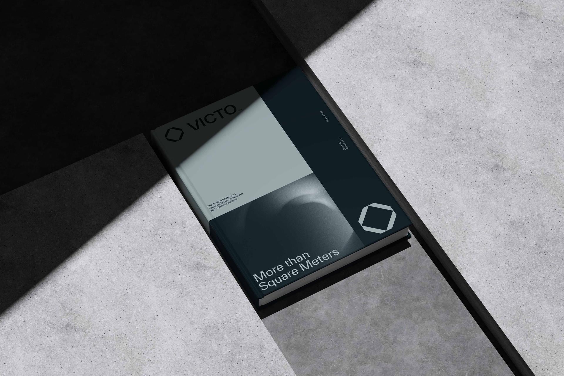
Complete brand and website refresh for a construction company that means business
Clarke’s Design and Construct is an award-winning construction company that has been in operation since the mid 2000s. A 15-year-old business is ideally placed to take stock of their market position, explore who they are as a business and where they want to be moving forward.
A rebrand is not about starting a new business. It is a process that explores business values and objectives, refines audience and customer needs, and how to put pressure on the competition. For Clarke’s, this rebrand was a way to let the industry know: ‘Hey, we’re here. And we mean business.’


Starting off with a series of meetings, we collected data and information to really understand the business.
We tracked every design touchpoint in the client journey to ensure we didn’t miss a thing. Next, we established a creative direction. This starts with three different brandscapes that cover colour, font, layout and overall feeling. From there, we finalised creative direction and moved on to logo development.


We decided to keep the current orange and blue colour palette and mature the colours slightly so the brand still had a similar feel.
We like to keep an element from the existing brand to maintain the feeling of evolution. Next up: font. The construction industry is masculine so we went with an uppercase strong bold font. The logo mark you see within the word mark represents Andrew, the owner of the business. It also represents a structure with a roof and strong foundation. The logo mark can be used on its own across social media and marketing collateral.


The new branding is strong yet simple. It gives Clarke’s a platform to showcase their straightforward, collaborative approach and can-do attitude.
It’s fun without being frivolous and makes it clear what Clarke’s actually do. The cross pattern used across the website and collateral stems from architectural plan drawings – a nod to the design part of the business – and ties everything together. The branding has been rolled out over many applications and has been a huge success.


Clarke’s Design and Construct engaged the team at Embark Agency to provide us with refreshed branding to reposition ourselves in the Industrial building market. By allowing the team at Embark Agency to use their creativity they provided us with a clear and strategic brand package that has instilled trust and confidence in our marketplace and has set us apart from our competition. Since the re-brand launch on 2020, Clarke’s Design and Construct has doubled its capacity as an industrial building company and we are now reaching a completely different type of clientele.

