


The 7 Types of Logos Explained with Examples

The seven main types of logos are wordmarks, lettermarks, pictorial marks, abstract marks, mascots, combination marks and emblems.
Each one represents your brand in a different way, suits different names and industries, and comes with its own strengths and trade-offs. Choosing the right type is one of the first real decisions in building a brand identity.
It also matters more than it used to. AI tools and DIY logo makers have put logo design in everyone’s hands, which is brilliant for getting something quickly, but it means a lot of businesses now pick a logo type by accident rather than on purpose. And the wrong choice is the kind of thing you end up paying to fix a few years down the track.
So this is the proper guide. What each type of logo is, real examples, the pros and cons, when to use it, which industries lean on it, and what the data says about the logo types brands actually use most. By the end you’ll know exactly which type fits your brand, and why.
Contents
- What is a logo, and why does the type matter?
- The 7 types of logos at a glance
- 1. Wordmark (logotype)
- 2. Lettermark (monogram)
- 3. Pictorial mark (icon or symbol)
- 4. Abstract mark
- 5. Mascot
- 6. Combination mark
- 7. Emblem
- Crests: a special kind of emblem
- The most used logo types: the data
- Which industries use which logo types?
- How to choose the right logo type
- Designing a logo in the age of AI
- Types of logos FAQs
- My takeaways
What is a logo, and why does the type matter?
A logo is the visual mark that identifies a brand, usually made from type, a symbol, or a combination of the two. It’s the most recognisable piece of your brand identity, the thing people spot at a glance and connect to everything they know about you.
The type of logo you choose decides how your brand gets stored in people’s memory. A wordmark builds recognition of your name. A symbol builds recognition of an image. A mascot builds an emotional character. These are genuinely different jobs, which is why the right type depends on your name, your industry, how established you are, and where the logo will actually be used, from a tiny app icon to a building sign.
Get it right and it compounds for decades. Get it wrong and you’re redesigning sooner than you’d like. Here are the seven main types, plus crests.
The 7 types of logos at a glance
| Type | What it is | Best for | Famous examples |
|---|---|---|---|
| Wordmark | The full name in distinctive type | Short, distinctive names | Google, Coca-Cola, Visa |
| Lettermark | Initials or a monogram | Long or hard-to-say names | IBM, NASA, HBO |
| Pictorial mark | A recognisable symbol or icon | Established, well-known brands | Apple, Target, Shell |
| Abstract mark | A non-literal symbol | Multi-service or global brands | Nike, Pepsi, Adidas |
| Mascot | A character or illustrated figure | Friendly, family and food brands | KFC, Michelin, Duolingo |
| Combination mark | Symbol and name together | Almost any business, especially new ones | Burger King, Lacoste, Adidas |
| Emblem | The name inside a symbol or badge | Heritage, authority, tradition | Starbucks, Harley-Davidson, BMW |
1. Wordmark (logotype)
A wordmark is a logo made entirely of your business name, set in a distinctive typeface. No symbol, just carefully crafted type. Think Google, Coca-Cola, Kelloggs, Sony and FedEx.
Don’t mistake a good wordmark for someone just typing a name in a font. The best ones are finely tuned, balancing spacing, weight and the way the letters interact, often with a clever detail hidden in plain sight (the arrow in the FedEx logo being the classic example).

| Pros | Cons |
|---|---|
| Builds strong recognition of your actual name | Only works if the name is short and distinctive |
| Clear and direct, tells people exactly who you are | Long names get cramped and hard to read |
| Easy to search for and remember | Less distinctive at very small sizes |
| Lives or dies on typography, so it can carry real personality | No symbol to use on its own as a shorthand |
Best for, and who uses it: short, memorable names. Wordmarks are common in fashion and luxury, media, technology and consumer brands where the name itself is the asset. If your name is the thing you want people to remember, this is your type.
2. Lettermark (monogram)
A lettermark is a logo built from initials, usually because the full name is long or a mouthful. IBM, HBO, CNN, JVC, NASA and HP all use one. A monogram is simply a lettermark where the letters are combined or overlapped.
The logic is practical. International Business Machines and National Aeronautics and Space Administration don’t make tidy logos. Their initials do.
I’ll be honest, though, lettermarks are my least favourite type, and I think a lot of small businesses make a real mistake reaching for one. A set of initials tells people nothing about who you are or what you do. It’s just letters with no meaning attached yet. It really only works once you’re big enough that people have started shortening your name for you, the way everyone says KFC instead of Kentucky Fried Chicken. That’s earned over time, not designed in on day one.
Most companies hiding behind an acronym are quietly missing a huge branding opportunity. The ones who get away with it are usually leaning on something else. Either they’re already established, with years of reputation and brand equity behind them, or they run a business model where the brand was never the main game in the first place. A medical specialist who lives almost entirely off doctor referrals, for example, doesn’t need their logo to persuade anyone. For everyone else, a name that actually says something will nearly always work harder than a row of initials.

| Pros | Cons |
|---|---|
| Shrinks a long, unwieldy name into something tight | The initials mean nothing until people learn them |
| Clean, simple and highly scalable | Hard to build recognition from scratch |
| Easy to use as an app icon or favicon | High risk of looking similar to other lettermarks |
| Feels established and professional | Needs the full name nearby in the early days |
Best for, and who uses it: long names, acronyms, and organisations that already have name recognition. Lettermarks are especially common in B2B, finance, media, education and government, where names are often long and formal.
3. Pictorial mark (brandmark, icon or symbol)
A pictorial mark, also called an icon, symbol or brandmark, is a recognisable image used to represent the brand, often with no words at all. The Apple ‘apple’. The Target ‘target’. The Shell ‘shell’. Even WWF, Playboy and the Twitter bird, before it became X.
Here’s the catch most people miss. Nearly every famous symbol-only logo started life sitting next to the company name, and only earned the right to stand alone after years of repeated exposure built the association. The symbol is the reward for recognition, not the starting point. They almost always started as a combination mark (more about these below).
![]()
| Pros | Cons |
|---|---|
| Instantly recognisable once established | Tough for new brands, the symbol means nothing yet |
| Works beautifully at any size, including tiny icons | Usually needs years of exposure to stand alone |
| Crosses language barriers | A literal symbol can box you into one product or idea |
| Visually striking and memorable | Easy to get generic if the concept is obvious |
Best for, and who uses it: established brands with the recognition to back it, and digital-first brands that need a clean app icon. Common in consumer technology, retail and apps. For a brand nobody knows yet, lead with your name and earn the symbol over time.
4. Abstract mark
An abstract mark is similar to a brandmark but is a symbol that doesn’t depict a literal object. Instead it uses shape, form and colour to capture a brand idea. The Nike swoosh, the Pepsi globe, the Adidas trefoil and the Airbnb belo are all abstract marks.
The advantage of going abstract is freedom. A literal picture ties you to a thing. An abstract mark can represent a feeling or an idea, which is why brands that do many things, or want to mean something bigger than a single product, often choose one.
![]()
| Pros | Cons |
|---|---|
| Not tied to any single product or literal meaning | Abstract shapes carry no built-in meaning |
| Can express a feeling or idea a picture can’t | Needs investment to build the association |
| Distinctive and ownable when done well | Easy to look generic in less skilled hands |
| Scales and works globally | Hard for a new brand to pull off alone |
Best for, and who uses it: brands that span multiple products, services or markets, where a literal symbol would be too limiting. Common in large companies as above, technology, telecommunications and finance.
5. Mascot
A mascot logo uses a character or illustrated figure to front the brand. KFC’s Colonel Sanders, the Michelin Man, Kellogg’s Tony the Tiger, Planters’ Mr Peanut, Mailchimp’s Freddie and, more recently, Duolingo’s owl.
In a market full of minimalist wordmarks and tidy abstract icons, a mascot is the contrarian move, and the data backs it. Characters tend to encode faster, get recalled more easily, and age better than geometric marks, as long as the brand commits to one and resists redesigning it every couple of years.

| Pros | Cons |
|---|---|
| Highly memorable and full of personality | Can look less serious for premium or corporate brands |
| Builds an emotional, human connection | Harder to reproduce cleanly at small sizes |
| Brilliant for social content and storytelling | More expensive to create and maintain |
| Stands out in a sea of minimalist logos | Needs a simplified version for favicons and labels |
Best for, and who uses it: friendly, approachable brands that want personality. Mascots are most common in food and beverage, family and children’s brands, sport, and hospitality.
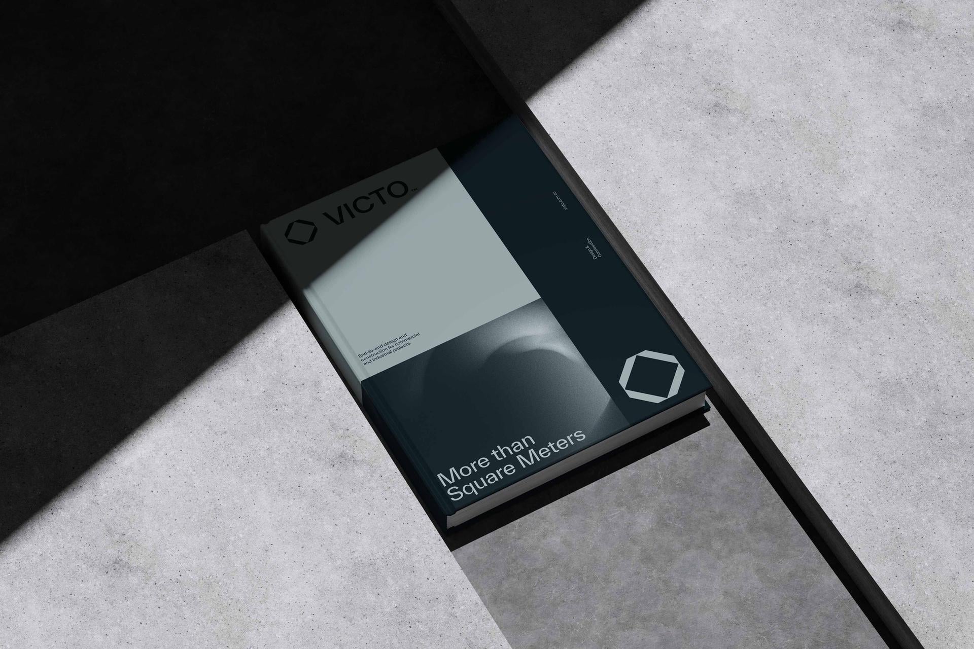
6. Combination mark
A combination mark pairs a symbol with your name, so you get the recognition of an image and the clarity of a wordmark in one. Amazon, Adobe, Xbox, Microsoft, Tesla, Nike, Nestle and Guinness all use combination marks.
This is the most versatile and most widely used type, and for good reason. It does two jobs at once: the name tells new audiences who you are, while the symbol builds visual recognition over time. As the brand grows, you can often split the symbol off and let it stand alone. It’s also usually easier to trademark than a symbol by itself.

| Pros | Cons |
|---|---|
| Builds name recall and visual recognition at once | More elements to balance and design well |
| Hugely flexible, use the full lockup or just the icon | Can feel busy if the parts don’t work together |
| The safest starting point for a new brand | Needs to stay legible when the name shrinks |
| Usually easier to trademark than a symbol alone | Two things to keep consistent, not one |
Best for, and who uses it: almost any business, and especially new or growing ones that need flexibility. It’s the most common logo type across the largest companies in the world, used across virtually every industry. If you’re not sure where to start, start here.
7. Emblem
An emblem places the name inside a symbol, badge, seal or crest, so the text and the shape are fused into one mark. Starbucks, Harley-Davidson, BMW and most universities use emblems.
Emblems feel traditional, established and authoritative, which is exactly why heritage brands and institutions love them. The trade-off is detail. A finely detailed emblem can turn into a smudge when you shrink it onto a business card or a favicon.

| Pros | Cons |
|---|---|
| Signals heritage, trust and authority | Detail can be lost at small sizes |
| Text and symbol locked into one solid mark | Harder and costlier to design well |
| Distinctive and difficult to copy | Less flexible than a combination mark |
| Strong sense of tradition and credibility | Can feel dated if not handled carefully |
Best for, and who uses it: brands that want to project heritage, quality and authority. Emblems are common in education, government, automotive, food and beverage, sport and hospitality.
Crests: a special kind of emblem
A crest is a heraldic style of emblem, typically built around a shield, badge or coat of arms. It’s the most traditional logo form there is, with roots in actual heraldry, and it signals history, prestige and belonging more powerfully than almost anything else.
You’ll see crests on universities and schools, football and sporting clubs, government and military bodies, premium spirits and wineries, and heritage hospitality like grand hotels. Think of the badge on a famous football club or the arms of an old university.
The strengths and weaknesses mirror emblems, just turned up. A crest carries enormous gravitas and tradition, but it’s the hardest type to reproduce cleanly at small sizes, and the easiest to make look stuffy if your brand isn’t genuinely built on heritage. Use a crest when history and authority are central to who you are. Avoid it if you’re trying to feel modern, nimble or accessible.

The most used logo types: the data
If you’re wondering which logo types brands actually use most, the numbers are clear. In an analysis of the logos of the Forbes 250 largest companies, 152 used a combination mark, making it comfortably the most popular type, and 58 used a wordmark. The remaining types shared what was left, which tells you something: at the top end, the safe, flexible combination mark wins.
A few more logo facts and figures worth knowing (treat these as directional, since studies vary):
- It takes most people somewhere between five and seven exposures to a logo before they reliably remember it. Recognition is built through repetition, which is the mere exposure effect at work.
- The average logo is redesigned roughly every ten years.
- Studies have found that around 88% of adults recognise the McDonald’s and Shell logos on sight.
- Colour can lift brand recognition by up to 80%, which is why an estimated 95% of the best-known brands use only one or two colours.
- Around two thirds of the top 250 companies’ logos are asymmetrical, suggesting that standing out now beats the old design rule of perfect symmetry.
The takeaway from the data is consistent. The most successful logos are simple, consistent, repeated often, and usually built as a flexible combination of name and symbol.
Which industries use which logo types?
Logo type isn’t rigidly tied to industry, plenty of brands break the mould, but clear patterns show up. Here’s the general lay of the land.
| Industry | Logo types it tends to favour | Why |
|---|---|---|
| Technology and SaaS | Wordmarks, abstract marks, combination marks | Need to scale to app icons and feel modern |
| Fashion and luxury | Wordmarks, emblems, monograms | The name and heritage are the asset |
| Food and beverage | Mascots, combination marks, emblems | Personality and shelf standout matter |
| Finance and B2B | Lettermarks, abstract marks | Long names, need to feel stable and serious |
| Education and government | Emblems, crests, lettermarks | Tradition, authority and formality |
| Sport | Emblems, crests, mascots | Belonging, heritage and team identity |
| Retail and consumer | Pictorial marks, combination marks | Built recognition, work across many touchpoints |
| Startups and small business | Combination marks, wordmarks | Flexible, build recognition from scratch |
How to choose the right logo type
The right logo type isn’t about taste, it’s about fit. Run your brand through these questions.
- Is your name short and distinctive? A wordmark or combination mark will serve you well. Long or a mouthful? Lean to a lettermark.
- Are you a new brand nobody knows yet? Start with a combination mark or wordmark. Avoid a symbol-only logo, you haven’t earned the recognition to pull it off yet.
- Where will the logo live most? If it’s app icons and tiny digital spaces, prioritise something simple and scalable. If it’s signage and packaging, you’ve got more room to play.
- What feeling are you going for? Heritage and authority point to an emblem or crest. Warmth and personality point to a mascot. Modern and flexible points to a combination mark.
- What does your positioning demand? This is the big one. Your logo type should express your brand strategy and positioning, not fight it. The type follows the strategy, never the other way around.
If you’re unsure, the honest default for most businesses is a combination mark. It’s the most flexible, the safest, and the easiest to grow into.
Designing a logo in the age of AI
Here’s where 2026 changes the picture. AI tools and DIY logo makers mean anyone can generate a logo, in any of these types, in about thirty seconds. That’s genuinely useful for getting moving. But it’s created two problems worth naming.
The first is the sea of sameness. When everyone can produce a competent, on-trend logo instantly, competent stops being a differentiator. A tidy logo used to set you apart. Now it’s the baseline, and a lot of AI-generated logos quietly look like each other.
The second is that picking a type by accident is now incredibly easy. A generator will happily hand you a slick symbol-only mark when, as a brand nobody knows yet, a combination mark would serve you far better. The tool doesn’t know your strategy. It just makes shapes.
Which brings it back to the point underneath all of this. A logo is not a brand. I’ve written about the difference between a logo and a brand, and it matters more than ever now. The logo type is the easy part, a tool can do it. The hard part, the part that actually sets you apart, is the strategy and positioning that decide which type is right and what it should say. Get the thinking right first, and any logo you make, by hand or with AI, has something true to express. Skip it, and you’ve just generated a nice shape that means nothing.
Types of logos FAQs
What are the 7 types of logos?
The seven main types of logos are wordmarks, lettermarks, pictorial marks, abstract marks, mascots, combination marks and emblems. Wordmarks and lettermarks are text-based, pictorial and abstract marks are symbol-based, mascots use a character, combination marks pair text and symbol, and emblems fuse the name inside a badge or shape. Crests are a traditional, heraldic style of emblem.
What is the most popular type of logo?
The combination mark is the most popular type of logo. In an analysis of the Forbes 250 largest companies, the combination mark was used far more than any other type, because it pairs a memorable symbol with the clarity of the brand name and stays flexible as a business grows. It’s also the safest starting point for most new brands.
What is the difference between a wordmark and a lettermark?
A wordmark uses the full business name in a distinctive typeface, while a lettermark uses only the initials or a monogram. Wordmarks suit short, memorable names like Google or Coca-Cola. Lettermarks suit long or hard-to-say names, like IBM or NASA, by compressing them into something tight and recognisable.
What type of logo is best for a small business?
A combination mark is usually the best logo type for a small business. It pairs a symbol with your name, so new customers learn who you are while you build recognition of the symbol over time. It’s flexible enough to use as a full lockup or just an icon, and it’s typically easier to trademark than a symbol alone.
What is an emblem logo?
An emblem logo places the brand name inside a symbol, badge, seal or crest, fusing the text and shape into a single mark. Emblems feel traditional and authoritative, which is why they’re popular with universities, automotive brands and heritage companies like Starbucks and Harley-Davidson. The main drawback is that detailed emblems can be hard to read at small sizes.
What is the difference between an emblem and a crest?
A crest is a specific, heraldic type of emblem, usually built around a shield, badge or coat of arms. All crests are emblems, but not all emblems are crests. Crests carry the strongest sense of history and prestige, which is why they’re common for universities, sporting clubs and government bodies, but they’re also the hardest logo type to scale down cleanly.
Can I design my own logo with AI?
Yes, AI tools can generate a logo in any style in seconds, which is useful for getting started. The limitation is that AI doesn’t know your strategy, so it can easily hand you the wrong type for your stage and produce something that looks like everyone else’s. The logo type and the positioning behind it still need human judgement, because a logo is not a brand.
How do I choose the right logo type for my brand?
Choose your logo type based on your name, your stage, where the logo will be used, the feeling you want to create, and above all your brand positioning. Short distinctive names suit wordmarks, long names suit lettermarks, new brands suit combination marks, and heritage brands suit emblems. The type should always express your brand strategy, not work against it.
My takeaways
There are seven main types of logos, wordmarks, lettermarks, pictorial marks, abstract marks, mascots, combination marks and emblems, plus the heraldic crest. Each one stores your brand in memory differently and suits a different name, stage and industry.
The data is refreshingly clear about what works. Simple beats clever, consistency beats novelty, and the flexible combination mark is the most used type at the very top of business for a reason. For most brands, especially newer ones, it’s the safest place to start.
But the type is only ever the expression. In a world where AI can generate any logo in seconds, the logo has never been easier to make or less able to set you apart on its own. The thing that still does is the strategy and positioning underneath it. Sort that first, and the right type, and the right logo, follows.
Leave your mark.
Ready to build a brand that drives growth?
Wherever your vision leads, we turn it into something people can see, feel and rally behind.